Published 17:41 IST, August 15th 2021
Meet Ashris, the coder who is re-imagining composition of India with maps of visual data
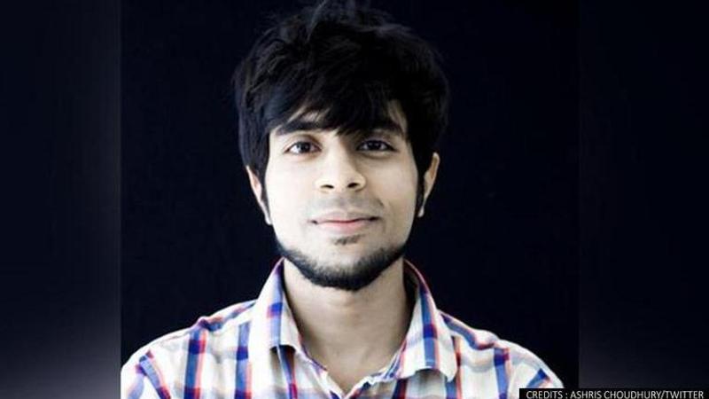
Ashris Choudhary is better known by the name of the page he administers, 'India in Pixels,' which is reimagining the Indian map using visual data content.

Advertisement
There are 29 states in India, where culture, language are divided by squiggly lines on paper. But it's difficult to remember facts and data of every state like the literacy rate of Central India or how different the literacy rate of the north is from south India, etc. Ashris Choudhury, a software engineer has an answer for that.
Ashris's visual representation
Ashris is better known by the name of the page he administers, 'India in Pixels,' which is reimagining the Indian map using visual data content. A while ago, he generated a colour-coded picture of India's most-to-least-vegetarian states using data from the union government's Sample Registration System Baseline Survey 2014 and Nutrition Journal.
Rajasthan had the greatest percentage of vegetarians in Rajasthan (75%) followed by Haryana (70%) and, then Punjab (60%) on the list of states with the highest percentage of vegetarians (67 per cent). In Lakshadweep, Telangana, West Bengal, Andhra Pradesh, Tamil Nadu, Nagaland, Kerala, and Jarkhand, less than 3% of the population eats no meat at all.
Ashris utilises simple data-driven graphics to convey complex cultural ideas in engaging and relevant ways. Colour-coded political maps of India make up the majority of his illustrations. Each one reveals something most people don't know about the country, the number of athletes who qualified for the Tokyo Olympics by state, the number of registered doctors per 100,000 people, the distribution of KFC restaurants, etc.
How does Ashris work?
The maps have struck a chord with the audience. Since its inception in 2019, @IndiaInPixels has amassed 83,000 Instagram followers, over 51,000 Twitter followers, and 112,000 YouTube subscribers. His ultimate goal is to create things that are built with empathy in mind. Like "India in Pixels," Ashris has another project named "Facebook Cluster Visualisation," which sheds light on the mechanics of polarisation, showing how being a part of both isolated and hyper-connected networks may lead to the humans living in a bubble, making it difficult for information that differs from our existing viewpoints to reach us.
Ashris gets his information from government and academic websites. The Census, Niti Aayog publications, the Ministry of Statistics and Programme Implementation, and data from the Centre for the Study of Developing Societies are among his most-used sources. He uses World Bank data and academic databases for worldwide figures.
Image- @iashris/Twitter
Updated 17:41 IST, August 15th 2021


